Book Cover Design Tutorial

Today, I’m going to offer a tutorial on using Photoshop to create a cover for your book. In today’s publishing world, authors are often responsible not only for the writing, but also marketing, graphic design, and web design – self-published authors are definitely left with the task of creating covers, unless they can afford to hire an artist. In a world where books are often judged by their covers, it is essential to design a book that looks professional, but a lot of authors do not have the skills to create their own covers.

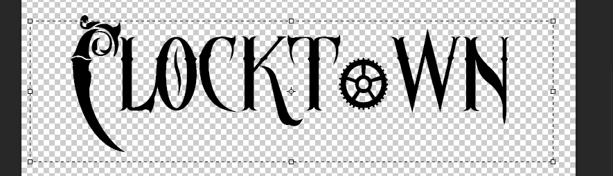
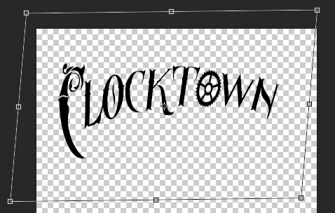
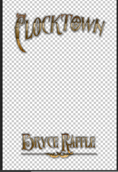
Recently, I came up with an idea for a new book series. It’s called Clocktown. I’ve got another book series in progress, so I’m not going to start on Clocktown yet, but just for fun, I thought I would use Clocktown as my example for this tutorial. Here’s what we’ll be making.

CoverDesignTutorial.jpg

Titles

Never underestimate the power of a good font. Typography goes a long way towards making your book cover look professional, so choose a good font. Hint: don’t pick Comic Sans. For my Clocktown example, I’ve chosen Ornatique, because I wanted something that was both quirky and decorative. I also used Time To Get A Watch for the letter ‘o,’ in order to help sell the clock theme.

Once you’ve downloaded and installed your fonts, open up Photoshop. Create a new document. Make it big; remember, you can always scale it down later. I’d start with 3200 x 4800 pixels, as we can always make smaller versions later, depending on the specifications of the publisher.

Then, using your text tool, draw a rectangle near the top and type your book’s title. For my example, I’m using Clocktown. I’ve adjusted the font size to 600.

Screen Shot 2015-11-29 at 12.33.47 PM.png

I would almost always recommend using a font with Small Caps – that is, a font that uses small capital letters rather than lower case. If your font does not have Small Caps, use all capital letters for your font, then adjust the size of the first letter of each word in your title, and adjust the size and spacing of the other letters.

Because I’m using multiple fonts, I’ll need to adjust the size of the second font to match.

Screen Shot 2015-11-29 at 12.35.56 PM.png

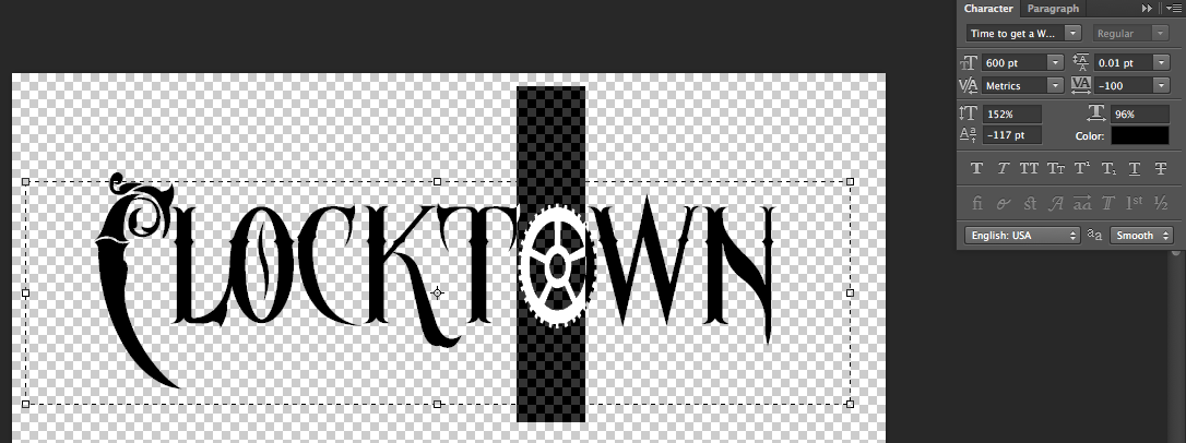
I also adjusted the size of some of the other letters to add character and drama to the title.

Screen Shot 2015-11-29 at 12.37.32 PM.png

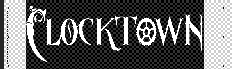
Finally, I’ve used the Create Warped Text tool to further accentuate the title.

Screen Shot 2015-11-29 at 12.47.20 PM.png

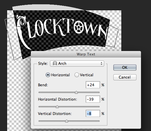
Then I’ve further warped the text using the transform skew function (Edit>Transform>Skew).

Screen Shot 2015-11-29 at 12.50.19 PM.png

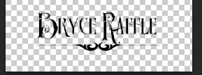
You’ll also want to create text for your author name, subtitle, etc. I’ve also added a divider, using a decorative font. I’ve used Old Retro Labels for my divider and I used Ornatique again for my name.

Screen Shot 2015-11-29 at 12.44.01 PM.png

Layer Styles

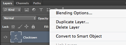
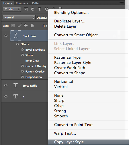
So far, we’ve created a fairly basic-looking title for our book. It can still be taken up a notch, by giving the title some depth and texture. The easiest way to do that in Photoshop is to use Layer Styles. Right-click on the Layer for your title, and choose Blending Options.

Screen Shot 2015-11-29 at 12.52.53 PM.png

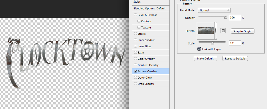
This opens up the Layer Styles panel. Here, we can adjust a number of settings for our font, including Bevel & Emboss, Drop Shadow, and Pattern Overlay. This is where the magic really happens.

Let’s start with Pattern Overlay. Click the check-box to turn it on, choose Normal for Blend Mode, and leave the Opacity at 100. Choose a Pattern. You can either choose one of the default patterns included with Photoshop or download and load a new one.

Screen Shot 2015-11-29 at 1.03.08 PM.png

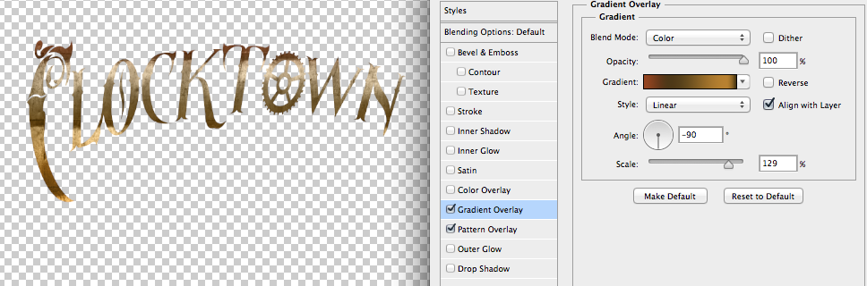
Next, add a gradient overlay. Change the Blend Mode to Color, leave Opacity at 100, and choose a gradient. Click on the gradient to open the Gradient Editor. You can choose one of the Presets or create a custom gradient. I’ve created a custom gradient with shades of brown and black.

Screen Shot 2015-11-29 at 1.05.50 PM.png

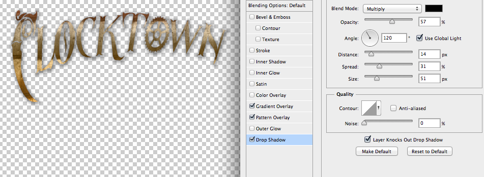
Next, we’ll want to add a drop shadow. You’ll be able to see it more clearly once you’ve added a background for your cover. For now, these are the settings I’ve used.

Screen Shot 2015-11-29 at 1.08.41 PM.png

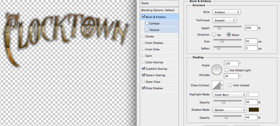
Next, Bevel & Emboss.

Screen Shot 2015-11-29 at 1.08.01 PM.png

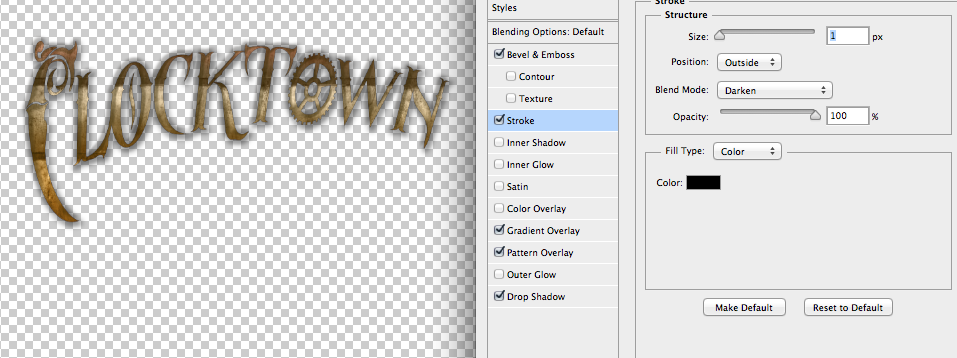
And finally, Stroke.

Screen Shot 2015-11-29 at 1.07.07 PM.png

Remember, you can always come back and adjust these settings later.

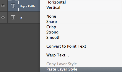
Once you’re happy with your Blending Options, click OK. Then, right-click on the title Layer, and choose “Copy Layer Style.”

Screen Shot 2015-11-29 at 1.10.27 PM.png

Then right-click on each of your other layers and choose “Paste Layer Style.”

Screen Shot 2015-11-29 at 1.11.53 PM.png

In the next part of the tutorial, we’ll look at creating a background for our cover. In the meantime, here’s what we’ve got so far.

Screen Shot 2015-11-29 at 1.12.14 PM.png

Here’s Part Two.

Story Structure

Lately, I’ve been struggling to make progress with my draft of Dead London.

I had a solid beginning, but I couldn’t figure out how to get from beginning to end. I began to feel like I was never going to get anywhere. Eventually, I came to the conclusion that I was missing something crucial structurally. Without proper story structure, I could never hope to get anywhere. So I started digging through the internet to see what other writers had to say about story structure. That’s when I realised…

There was so much I didn’t know about story structure, I was like a skydiver, jumping without a parachute. No wonder my story kept plummeting.

Much to my surprise and delight, story structure can be broken down into different parts: these components even have names. I had heard of some of them. The Inciting Incident. The Climax. The Resolution. But there were other plot points that I didn’t know much about. Pinch Points. The First Plot Point. The Key Event.

The First Plot Point

Of the many websites I came across, this one was one of the best. And the author writes dieselpunk!

“The first plot point is the moment when the setup ends, and your character crosses his personal Rubicon. But this isn’t just an event that happens to him…This is an event that either incorporates or is directly followed by the character’s reacting in a strong and irrevocable way.”

The more I read up on the First Plot Point, the more I began to wonder what mine was. Not a good reaction to have. You would think that I would know my story so well that once I understood what the First Plot Point was, I would know immediately what mine was. I had to give it a lot of thought. Eventually, what I realised was that I’d put my First Plot Point too early. Much too early. The First Plot Point should occur around the 25% mark. Mine happened around the 3% mark. Again, way too early!

From the same website:

“If you’ve ever watched or read a poorly plotted story that skipped or postponed the first plot point, you probably instinctively sensed the story was dragging. Likely, you grew bored and got up to do something else without finishing the story. No first plot point means no turning point means the first act drags on too long—or, conversely, if the first plot point takes place too early, the second act drags on.”

Finally, I had figured out one of the major problems with my story structure. At last, I was ready to get back to writing. With a few changes to the first couple of scenes, I shifted my first act to avoid that First Plot Point from happening right away. Then it was just a matter of coming up with a new First Plot Point. I think I came up with a good one. Dead London is a zombie novel, so the First Plot Point had to have something to do with zombies. I won’t say more than that because spoilers. But what I will say is that after fixing the end of Act One with a solid First Plot Point, I finally feel like I’m on track to write the novel I initially set out to write.

Hopefully this helps someone else as much as it helped me! Now that I’ve got the First Plot Point down, I’ve got to nail the First Half of the Second Act. Then onward!

Quick Guide to Smashwords

Recently, I helped publish Denizens of Steam on Smashwords. I thought I’d share what I learned.

First, let me just say that if you haven’t heard of Smashwords, it’s well worth checking out. Smashwords is a site for writers and readers. As an author, Smashwords can help you get your book out to the masses, and with no cost for their services, free ISBN’s, and distribution to Scribd, barnesandnoble.com, and a number of other sites, it’s definitely worth the time and effort.

That said, as a previously unpublished writer, there were a ton of things I didn’t know about publishing or formatting, and it was necessary to learn these things before publishing. Smashwords offers a Style Guide to help writers get started. It’s filled with useful information for writers with thoroughly detailed instructions for formatting for Smashwords. It’s also 117 pages long, and even after following the instructions, I still got errors that caused the conversion process to fail.

A number of key points

117 pages of instructions for formatting instructions proved to be more than I had patience for. A lot of the details in the guide could have been stripped down to the bare essentials. A couple of quick points:

  1. Smashwords allows writers to upload books in epub or Word doc format (doc, not docx). They do not allow you to upload mobi, html, or plain text formats, even though they distribute in these formats. Instead, they convert your book for you, taking your Word Doc and converting from that. So, don’t waste your time exporting mobi formatted books, like I did.
  2. Smashwords conversion software is a bit temperamental. Make sure you format your word doc correctly, or you’ll get errors. Quick formatting tip: Smashwords suggests avoiding “exotic fonts.” They suggest using Times New Roman, Arial, or Garamond. Do not use Garamond, as I did. It caused the conversion to fail.
  3. Font colour should be set to “Automatic.” Note that this is not the same as black, even if it looks black. Do this as your very last step. If you set up a table of contents for your book, you’ll be using hyperlinks, which tend to mess with the font colour. Be sure to change the font back to automatic after this step. This is very important, as skipping this step will cause conversion to fail.
  4. This one might be obvious, but in case it’s not, I’ll say it anyway. Don’t manually indent (by pressing the tab key). Instead, set up your alignment using the Ruler.
  5. Key points in the style guide: how to set up your table of contents. There are a number of ways to set up a TOC in Word, but make sure you follow the instructions in the Style Guide, or you may run into trouble.

If you want to grab yourself a (free) copy of Denizens of Steam, it’s now available in both mobi and epub formats, and you can get it at Smashwords, Scribd, Barnes & Noble, and Kobo. Be sure to leave a review!

Denizens of Steam

A collection of Steampunk tales of fantasy and high adventure

In an earlier post, I mentioned my online writing group, Scribblers’ Den, and hinted vaguely that there was more to come. Well, there was indeed, and it’s here now. Wait, what is?

We give you…
DenizensEpubMockup

Denizens of Steam

As I said, it’s a collection of Steampunk tales of fantasy and high adventure. It’s also the Scribblers’ Den’s first anthology, and it was written, curated, and edited by members of the den. It includes short stories written by Steve Moore, N.O.A. Rawle, David Lee Summers, C.L. Zeitstück, Katie Alford, William J. Jackson, Bryce Raffle, Alice E. Keyes, Albrecht von Saarbruchen, Karen J. Carlisle, Jenny Jobe, and J.P. Paradise. And it includes a foreword by Scribblers’ Den founder, Jack Tyler.

Get it for FREE on Smashwords.