Book Review: Stormdancer

Stormdancer, by Jay Kristoff

A year or two ago, my friend and coworker asked if we could stop in at Chapters on our way back to work during our coffee break. He wanted to grab the sequel to a book he’d read. Of course, I agreed, and we set off for Chapters. He found his book, bought it, and explained what it was about. Two words and I was instantly intrigued: Japanese steampunk.

The book was Kinslayer, #2 in the Lotus War series by Jay Kristoff, and it was the sequel to Stormdancer. I later went back to the bookstore and bought Stormdancer for myself.

It sat on my bookshelf for about two years, while I made my way through my ever-growing collection of mostly steampunk books. After reading all of Cherie Priest’s Clockwork Century novels, all of Gail Carriger’s Parasol Protectorate series (not to mention Prudence), as well as Doktor Glass (Thomas Brennan), The Constantine Affliction (T Aaron Payton), Whitechapel Gods (S.M. Peters), and Bronze Gods (A.A. Aguirre), finally, I got around to reading Stormdancer.

My only regret is not reading it sooner

Arashitoras are supposed to be extinct. So when Yukiko and her warrior father Masaru are sent to capture one for the Shõgun, they fear that their lives are over – everyone knows what happens to those who fail the Lord of the Shima Isles.

I can’t say much else about the plot without spoilers. The book starts out a bit slow. To be fair, Jay Kristoff spends a lot of the first few chapters on setting up the world of Kigen and takes his time with it. It’s worth the wait.

Kigen is a world reminiscent of feudal Japan, but with chi-fueled technology – airships, mechanical samurai, and chainsaw-katanas. I guess you could say it’s not really steampunk (it’s chi-punk)…but that would be silly. It’s Japanese steampunk. And it’s awesome.

But when Yukiko and her father finally see the arashitora for the first time, that’s when book really picks up. It’s an incredible moment, just as powerful for the reader as it is for Yukiko. The arashitora is not only a magnificent mythological beast, but also one of the most interesting, fiercest, and most likable characters in the novel.

The book held my interest throughout the rest of the novel, with epic battles fought, political intrigue, a bit of romance, fantastical machines, and a climactic conclusion. The lead character had a ton of growth from beginning to end. As I read the few closing pages, it was hard to think of that angsty, obnoxious, emo teenage girl that graced the first few pages of the novel.

Definitely enjoyed Stormdancer, and would certainly add it to my list of favourites. Can’t wait to start reading Kinslayer!

Version Control for Writing

Using version control for writing

For my day job, I develop computer games. I’ve been doing that for about four years now. I’ve enjoyed a couple of different roles in the game industry, including sound designer and writer. For both of those roles, I’ve needed to understand and use version control software. So as I was giving some thought to a few problems I’ve been having with managing my writing – switching back and forth between different computers (laptop, desktop), losing track of which draft I’m on, and worrying about saving backups – I thought of applying version control software to writing.

Sure, github (and other version control software)’s intended use is for software developers – projects that are being developed by multiple developers – so it might seem a bit over the top to use for writing. On the other hand, github is surprisingly easy to use even just for very basic versioning, and it works like a charm. So, why not use it for writing?

Here’s how I’ve been using it

I’m not going to give you a full-on tutorial. I will walk you through some of the basics, though, and give you a brief overview of how I’ve been using github.

First, you’ll need to set up your account. You can do this by visiting github.com and clicking the bright green “Sign up” button. Then just follow their instructions. Once you’re all set up, download the desktop software from here. Got it? Great. Install the software (obviously), and launch it.

Next up, create a repository for your writing. I’m using the Mac version of the software. The Windows version might look a little different.

Screen Shot 2015-12-22 at 10.50.22 PM.png

On the Mac, you just click the little + icon. Then you type the name for your repository, choose where you want it on your computer, and click “Create Repository.” This creates a folder on your computer at the location you chose. I called mine Dead London and stuck it on my desktop.

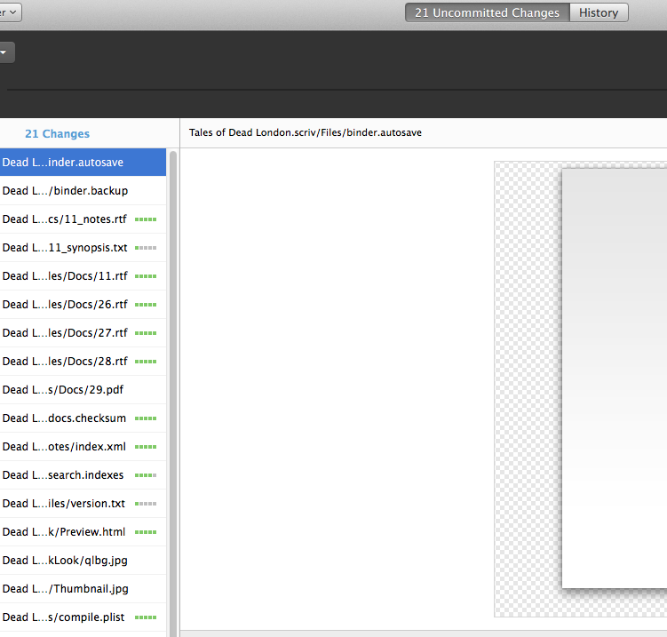
Then, after I saved my latest draft of Dead London in the folder, the files showed up under Uncommitted changes in github.

Screen Shot 2015-12-22 at 10.58.31 PM.png

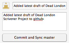
I typed in a summary and description of my changes (“Added latest draft of Dead London”) and clicked Commit and Sync master.

Screen Shot 2015-12-22 at 11.01.18 PM.png

I then downloaded the github application on my laptop. Then I cloned the Dead London repository (File>Clone Repository). Then, after I finished working on my laptop, I committed and synced my changes in github.

Back on my desktop, all I had to do was sync, and I now had all the latest changes from my laptop. And I also had a backup on the cloud, plus a history of my changes.

Past Lives

I don’t really believe in reincarnation.

Much as I am taken in by the romantic concept of reincarnation, I don’t really believe in it. It’s a nice idea, to think that we might have had past lives, that we might live on in some way after we’re gone, and I can easily imagine myself in some distant path, in another body but with the same soul. Sure, I like the idea, but do I truly believe? No, certainly not.

But then, earlier this year, I took a trip to London. I wanted to carry out a bit of research for the novel I’m working on (Dead London), and I also just needed to get away for a little while. I had been to London before, as a child, but surely that wasn’t the only reason that my trip to London felt more like a homecoming than a vacation. I felt a strange kinship with the city, the sense that I somehow belonged there. It was difficult to leave; I began forming plans to relocate, even while I was still there, and I gave it serious consideration when I returned to Vancouver. Later, when I looked at photos from my trip, I felt not merely sadness for my trip being over, but actual homesickness. I had never felt homesickness before – so why was I feeling that for a city that I had merely visited? Was it possible that in some distant past, London truly was the place I called home?

Perhaps, not so distant a past…

When I think of London, a city with a long history, I can’t help but associate it with a particular time period. Perhaps it’s just that I’ve watched too many movies or read too many books, but I tend to picture the city lit by gaslight. I think of Jack the Ripper stalking the streets, of Dickensian orphans working in factories or as chimney sweeps. I think of a city filled with fog and smoke. I think of gentlemen and ladies attending the opera or the ball, while the poor die of consumption. with slums and tenements only blocks away from the wealthy elite. I think of opium dens and absinthe. I think of Victorian London.

If I truly did have a past life, maybe it wasn’t so long ago. For all that it seems like the distant past, given how rapidly technology has changed in the past century or two, the Victorian era isn’t really that far in our past. Not, when you consider the long life that London has had. So, if I did happen to believe in reincarnation, I might be swept away by the notion that a past version of me once walked the streets of Victorian London. Perhaps he – or she, for that matter – once looked into the face of Jack the Ripper. He might have been a famous artist, or a humble factory worker, or an inmate at Newgate Prison, destined only for the hangman’s noose.

Perhaps that’s why I felt such a connection with London. Or maybe, just maybe, there’s a simpler explanation. Perhaps it’s because I’ve been writing and researching Dead London for several years now, and it’s become so ingrained in my imagination that it has begun to feel like home. One of the many curses of being a writer, after all, is that our characters can at times feel more real or more important to us than real people. A city like London is quite the character.

Book Cover Design Tutorial (Part Two)

Background

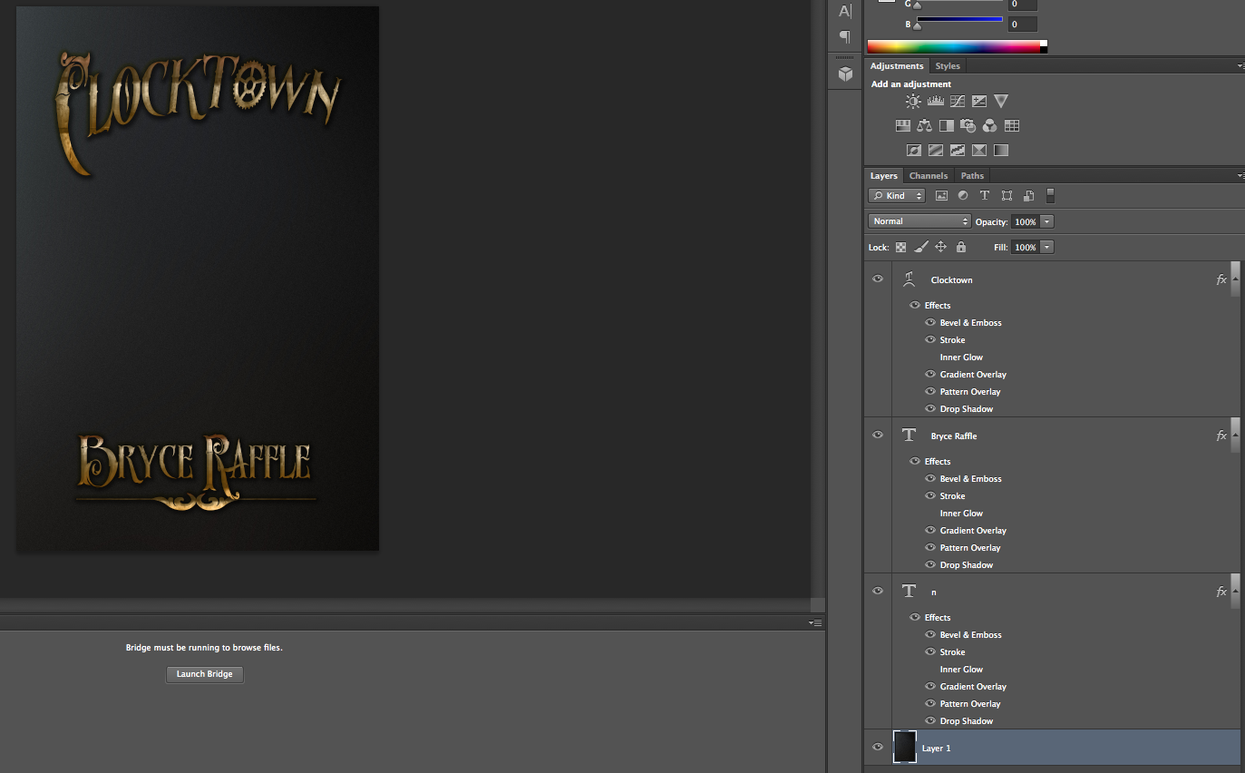
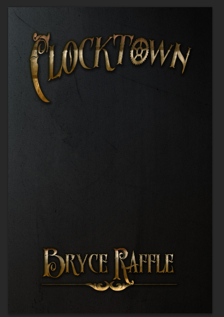
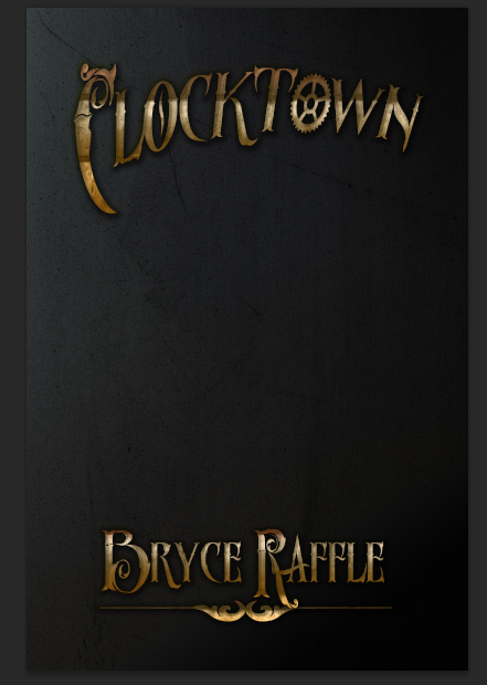
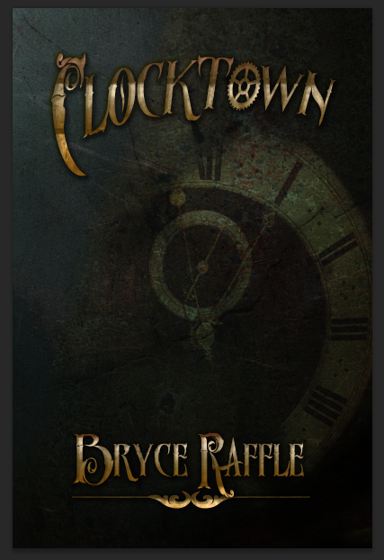
In Part One of this tutorial, we looked at creating text for our titles and author name for our book cover. In this part, we’ll design a background. For my Clocktown example, I started by creating a new layer (Layer>New>Layer…). Make sure this layer is below your titles.

On this layer, I added a dark blur background, which I downloaded from Splitshire.com. Resize the image to fit your canvas, using the Transform tool.

Screen Shot 2015-11-29 at 4.42.09 PM.png

Next, I added a texture. There are a ton of places to find textures online, many of which offer textures for free. A quick internet search for “free textures” should yield a bunch of results. I used Vintage Halftone Textures Volume 1 from Creative Market, which I downloaded during a free giveaway.

Screen Shot 2015-11-29 at 4.50.51 PM.png

As you can see, it’s looking better already.

Next up, make a new layer, and choose the gradient tool. Choose black for your foreground color, light grey for your background color, and add a gradient at an angle. Change the Blend Mode to “Darken,” and the Opacity to 80% for this layer.

Screen Shot 2015-11-29 at 4.57.12 PM.png

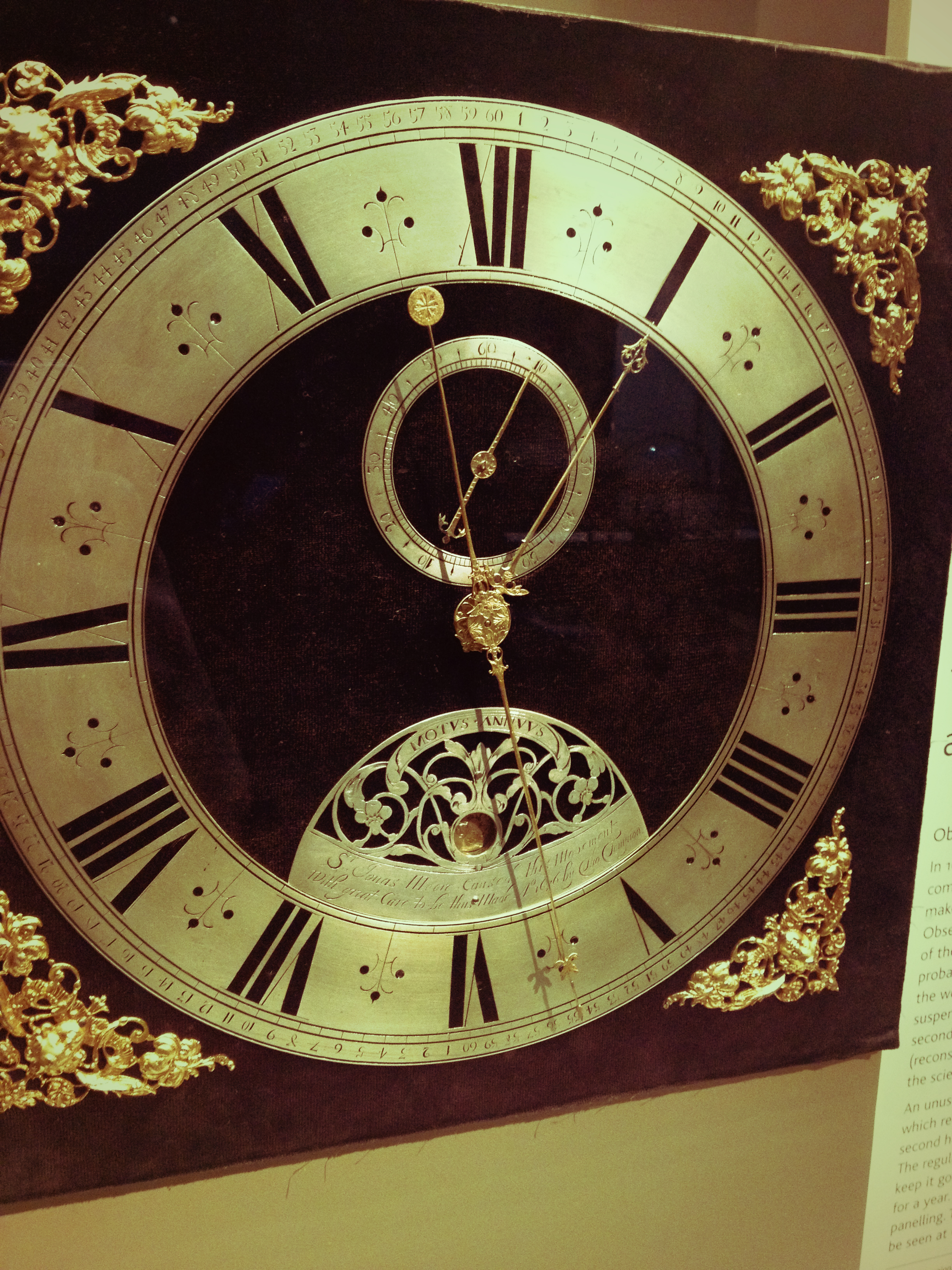
Moving on, I wanted to use an image that really helped sell the clock theme for the book. I decided to keep it simple and use a photo of a clock. Here’s where you might want to start digging into stock photos; these can be purchased for a reasonable price from a number of different sites. Some websites do offer free stock photos, but it can be difficult to find the right photo for your project when you are limited to free options. Consider taking your own photographs. I dug up this clock photo I’d taken a while back.

IMG_1065.JPG

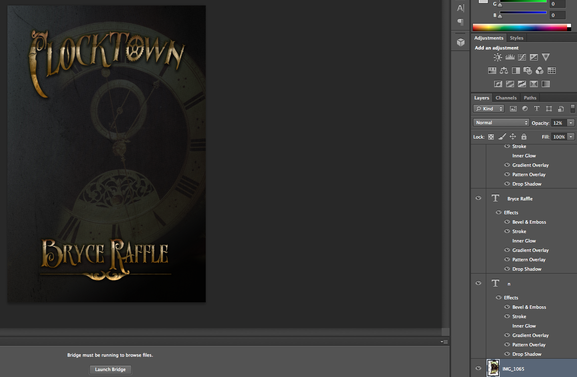
Drag your image to a new layer and resize to fit. Reduce the opacity for the layer, and use your eraser tool to blend it in smoothly.

Screen Shot 2015-11-29 at 5.10.26 PM.png

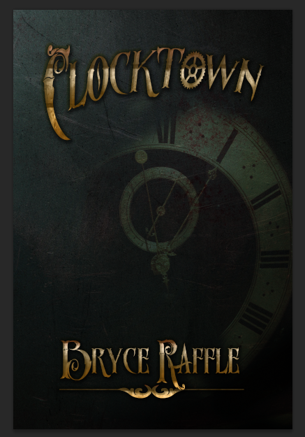
Next, I added another texture. I used this one from TextureKing. Resize to fit using the Transform tool, and hit Enter. Change your Blend Mode to Overlay and reduce the Opacity. At this point, I also adjusted the positioning of my clock photo, adjusted its Opacity, and blended a bit more with my eraser.

Screen Shot 2015-11-29 at 5.20.17 PM.png

Next, I added yet another texture. Again, I used the Overlay Blend Mode, and adjusted the Opacity, and cleaned the layer up with the eraser. This time, I used this texture from TextureKing.

Screen Shot 2015-11-29 at 5.24.29 PM.png

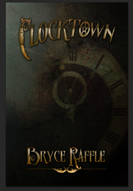
Next, I added another Blur Background. I used the Soft Light Blend Mode, and left the Opacity at 100. I got my Blur Backgrounds from Creative Market, but again, you can find these with your search engine; there are plenty of free ones out there (try Splitshire, for example). Since we’re using the blur background to add a bit of light to our image, try to find a brightly colored one.

Screen Shot 2015-11-29 at 5.28.31 PM.png

Now our background is starting to look pretty good. It’s time to add something to the foreground.

Foreground

Again, you’ll want to dig into stock photos for this part. As my cover is only being used for the purposes of this tutorial (for now), I decided to try to find stock from Deviant Art; if I were to publish, I would need to purchase a license. Many deviant artists don’t make their stock photos available for such purposes, so you may want to look elsewhere.

For my tutorial, I’ve used The Power of Belief 1 by Robnote, as the artist is kind enough to allow his stock to be used outside of deviant art. Note that I have credited him here.

After adding the image to photoshop, I resized the photo so that the man’s face was taking up almost the entire canvas, and positioned it so that only half of his face was visible.

Screen Shot 2015-11-29 at 5.37.39 PM.png

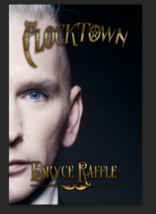
I then erased the background of the photo, leaving only his face visible, and changed the Blend Mode to Lighten. I adjusted the positioning of his face somewhat, and to make the image easier to work with, I cropped it to fit the size of the canvas. We’re almost done.

Screen Shot 2015-11-29 at 5.43.11 PM.png

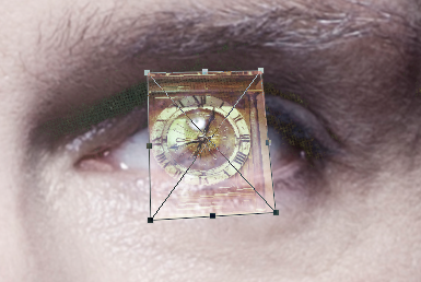
The next step should add a bit more interest to the cover. We’re going to give him clocks for eyes. I used another photograph I took myself, added it to a new layer, and adjusted the size to match his eye. I then changed the Blend Mode to Screen, and using the Skew tool, adjusted the clock so it was right over top of his eye.

Screen Shot 2015-11-29 at 5.48.09 PM.png

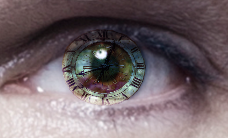
Change the Blend Mode back to normal and erase around the clock so that only the face is left.

Screen Shot 2015-11-29 at 5.52.10 PM.png

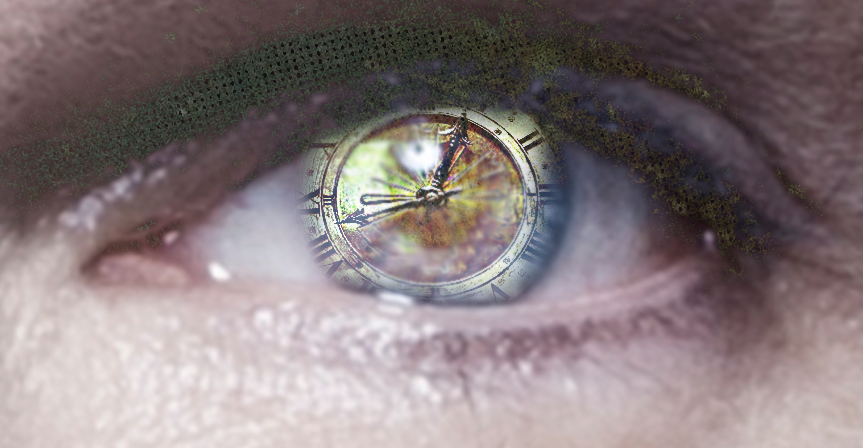
Using a soft edged eraser, trim around the eyes a bit more. Change the Blend Mode to accentuate the eyes. I ended up using Screen, but I also found a few other Modes that I liked.

Screen Shot 2015-11-29 at 6.00.39 PM.png

Finally, I added one more texture. This one, I applied over top of all of my layers, including the text.

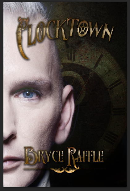
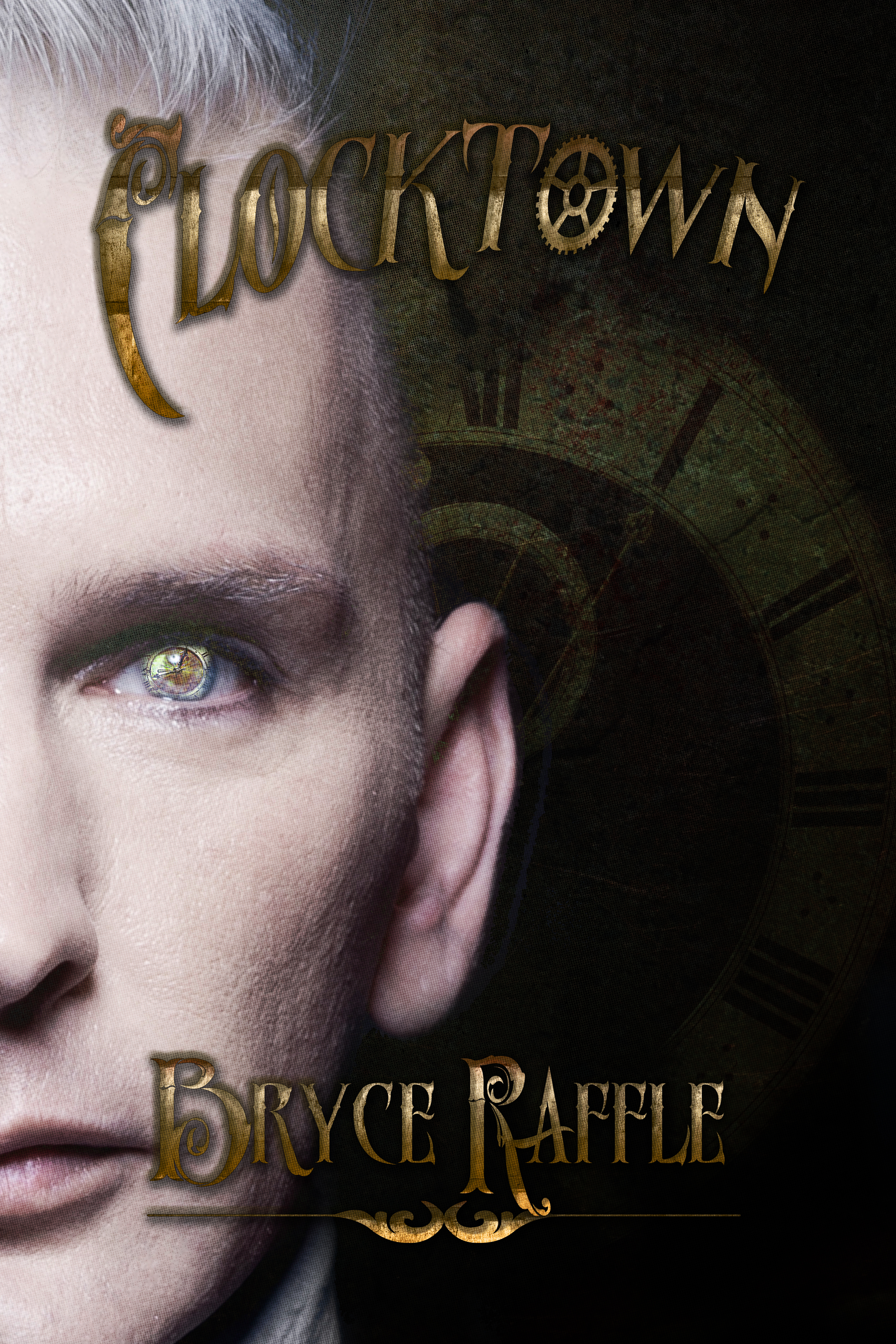
Here’s the final cover.

CoverDesignTutorial.jpg