Background
In Part One of this tutorial, we looked at creating text for our titles and author name for our book cover. In this part, we’ll design a background. For my Clocktown example, I started by creating a new layer (Layer>New>Layer…). Make sure this layer is below your titles.
On this layer, I added a dark blur background, which I downloaded from Splitshire.com. Resize the image to fit your canvas, using the Transform tool.
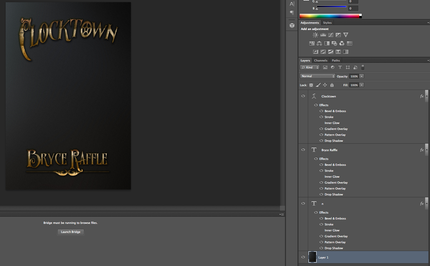
Next, I added a texture. There are a ton of places to find textures online, many of which offer textures for free. A quick internet search for “free textures” should yield a bunch of results. I used Vintage Halftone Textures Volume 1 from Creative Market, which I downloaded during a free giveaway.
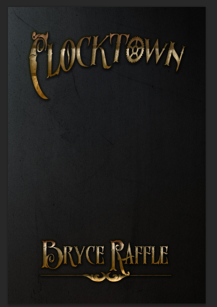
As you can see, it’s looking better already.
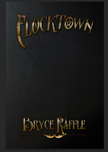
Next up, make a new layer, and choose the gradient tool. Choose black for your foreground color, light grey for your background color, and add a gradient at an angle. Change the Blend Mode to “Darken,” and the Opacity to 80% for this layer.
Moving on, I wanted to use an image that really helped sell the clock theme for the book. I decided to keep it simple and use a photo of a clock. Here’s where you might want to start digging into stock photos; these can be purchased for a reasonable price from a number of different sites. Some websites do offer free stock photos, but it can be difficult to find the right photo for your project when you are limited to free options. Consider taking your own photographs. I dug up this clock photo I’d taken a while back.
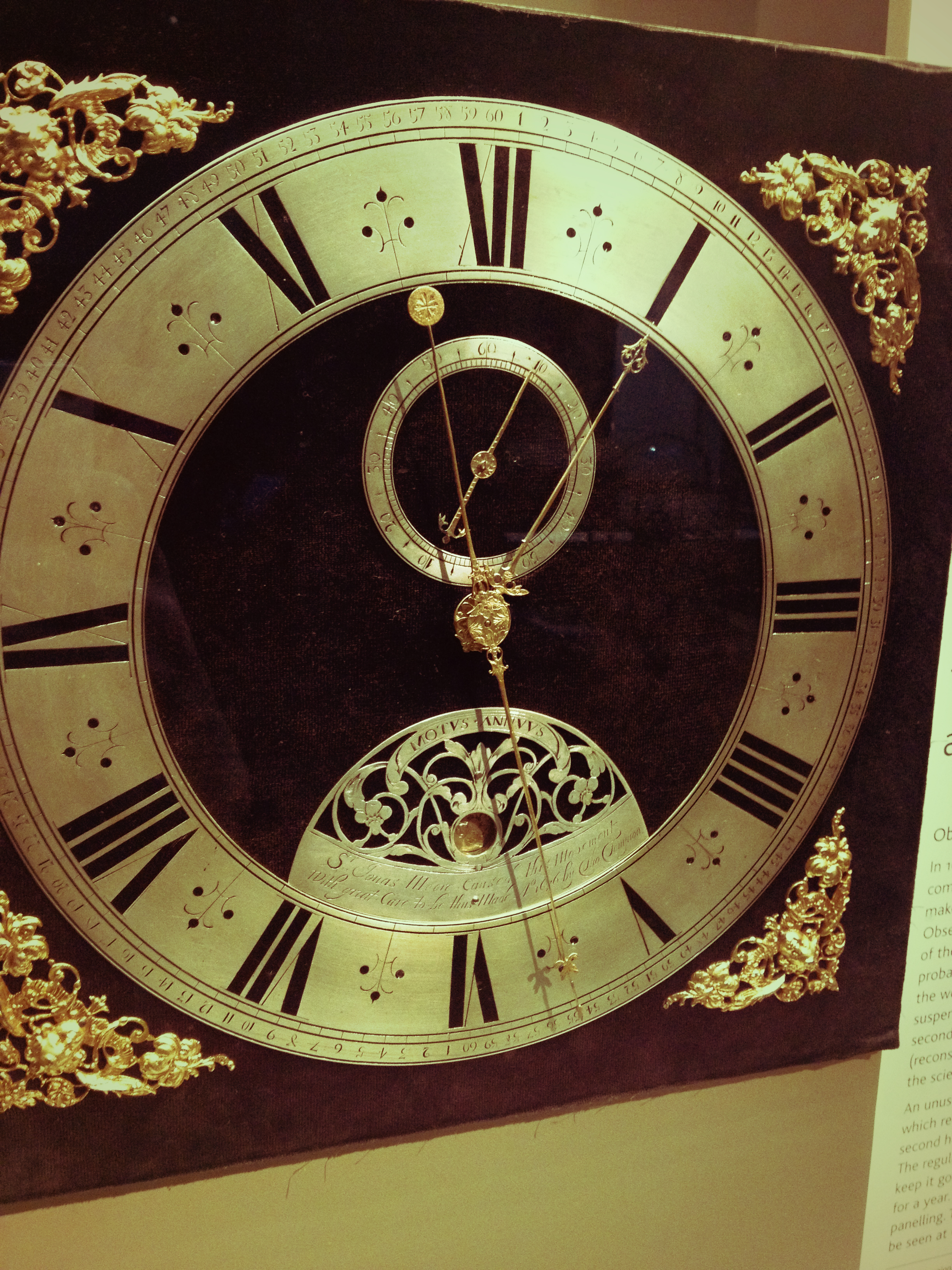
Drag your image to a new layer and resize to fit. Reduce the opacity for the layer, and use your eraser tool to blend it in smoothly.
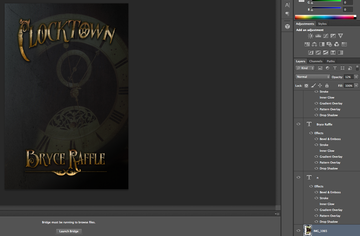
Next, I added another texture. I used this one from TextureKing. Resize to fit using the Transform tool, and hit Enter. Change your Blend Mode to Overlay and reduce the Opacity. At this point, I also adjusted the positioning of my clock photo, adjusted its Opacity, and blended a bit more with my eraser.
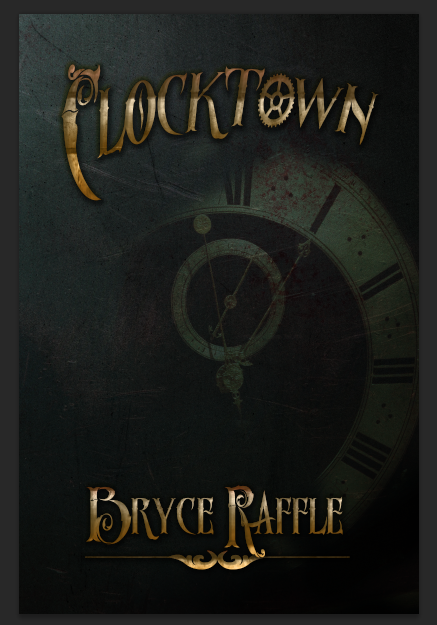
Next, I added yet another texture. Again, I used the Overlay Blend Mode, and adjusted the Opacity, and cleaned the layer up with the eraser. This time, I used this texture from TextureKing.
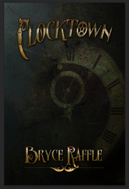
Next, I added another Blur Background. I used the Soft Light Blend Mode, and left the Opacity at 100. I got my Blur Backgrounds from Creative Market, but again, you can find these with your search engine; there are plenty of free ones out there (try Splitshire, for example). Since we’re using the blur background to add a bit of light to our image, try to find a brightly colored one.
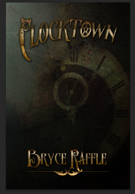
Now our background is starting to look pretty good. It’s time to add something to the foreground.
Foreground
Again, you’ll want to dig into stock photos for this part. As my cover is only being used for the purposes of this tutorial (for now), I decided to try to find stock from Deviant Art; if I were to publish, I would need to purchase a license. Many deviant artists don’t make their stock photos available for such purposes, so you may want to look elsewhere.
For my tutorial, I’ve used The Power of Belief 1 by Robnote, as the artist is kind enough to allow his stock to be used outside of deviant art. Note that I have credited him here.
After adding the image to photoshop, I resized the photo so that the man’s face was taking up almost the entire canvas, and positioned it so that only half of his face was visible.
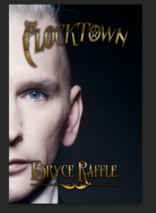
I then erased the background of the photo, leaving only his face visible, and changed the Blend Mode to Lighten. I adjusted the positioning of his face somewhat, and to make the image easier to work with, I cropped it to fit the size of the canvas. We’re almost done.
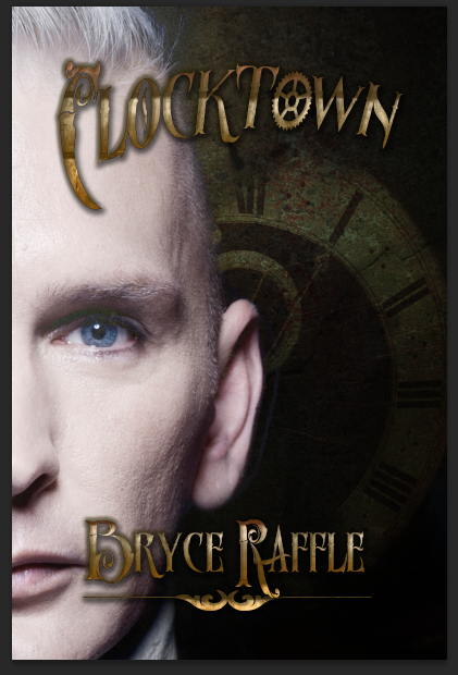
The next step should add a bit more interest to the cover. We’re going to give him clocks for eyes. I used another photograph I took myself, added it to a new layer, and adjusted the size to match his eye. I then changed the Blend Mode to Screen, and using the Skew tool, adjusted the clock so it was right over top of his eye.
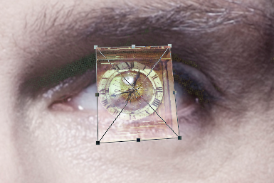
Change the Blend Mode back to normal and erase around the clock so that only the face is left.
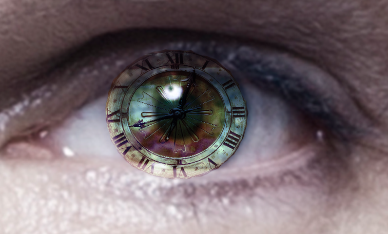
Using a soft edged eraser, trim around the eyes a bit more. Change the Blend Mode to accentuate the eyes. I ended up using Screen, but I also found a few other Modes that I liked.
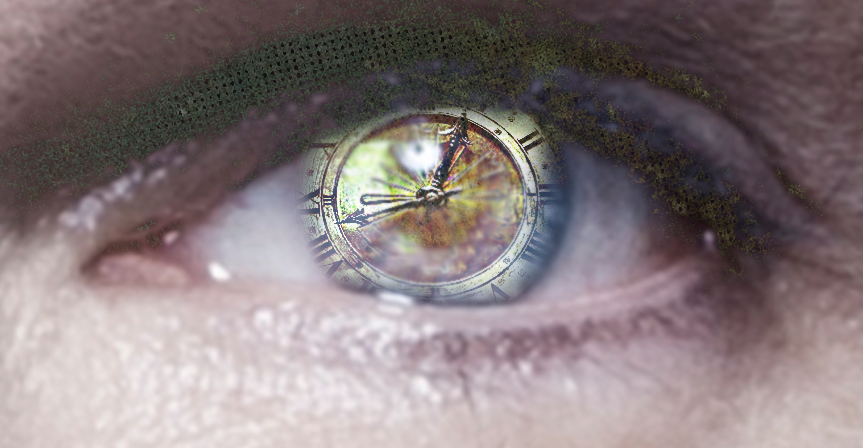
Finally, I added one more texture. This one, I applied over top of all of my layers, including the text.
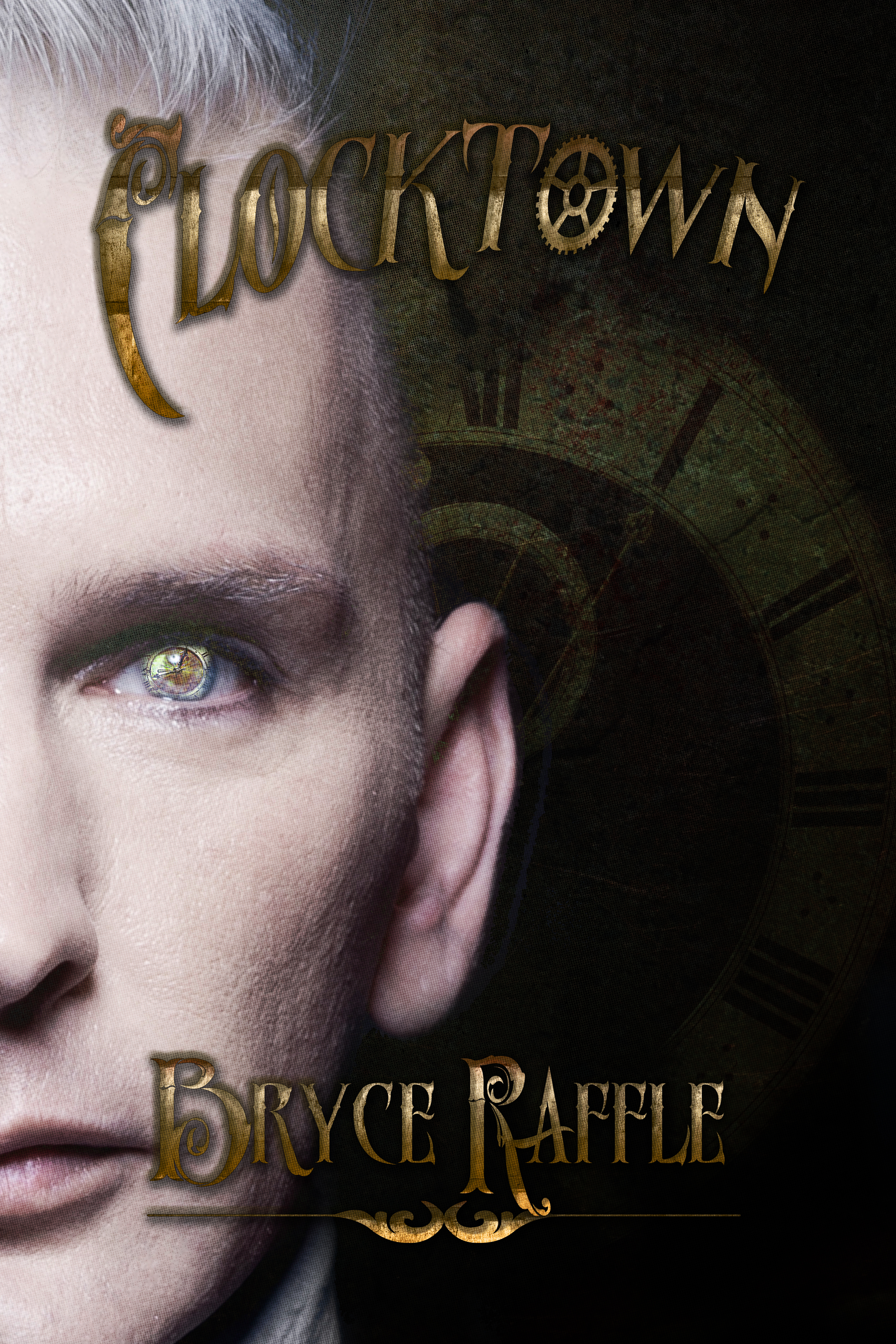
Here’s the final cover.

One Reply to “Book Cover Design Tutorial (Part Two)”
Comments are closed.