Today, I’m going to offer a tutorial on using Photoshop to create a cover for your book. In today’s publishing world, authors are often responsible not only for the writing, but also marketing, graphic design, and web design – self-published authors are definitely left with the task of creating covers, unless they can afford to hire an artist. In a world where books are often judged by their covers, it is essential to design a book that looks professional, but a lot of authors do not have the skills to create their own covers.
Recently, I came up with an idea for a new book series. It’s called Clocktown. I’ve got another book series in progress, so I’m not going to start on Clocktown yet, but just for fun, I thought I would use Clocktown as my example for this tutorial. Here’s what we’ll be making.

Titles
Never underestimate the power of a good font. Typography goes a long way towards making your book cover look professional, so choose a good font. Hint: don’t pick Comic Sans. For my Clocktown example, I’ve chosen Ornatique, because I wanted something that was both quirky and decorative. I also used Time To Get A Watch for the letter ‘o,’ in order to help sell the clock theme.
Once you’ve downloaded and installed your fonts, open up Photoshop. Create a new document. Make it big; remember, you can always scale it down later. I’d start with 3200 x 4800 pixels, as we can always make smaller versions later, depending on the specifications of the publisher.
Then, using your text tool, draw a rectangle near the top and type your book’s title. For my example, I’m using Clocktown. I’ve adjusted the font size to 600.

I would almost always recommend using a font with Small Caps – that is, a font that uses small capital letters rather than lower case. If your font does not have Small Caps, use all capital letters for your font, then adjust the size of the first letter of each word in your title, and adjust the size and spacing of the other letters.
Because I’m using multiple fonts, I’ll need to adjust the size of the second font to match.
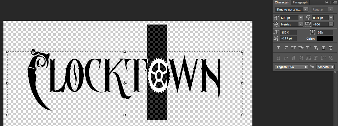
I also adjusted the size of some of the other letters to add character and drama to the title.

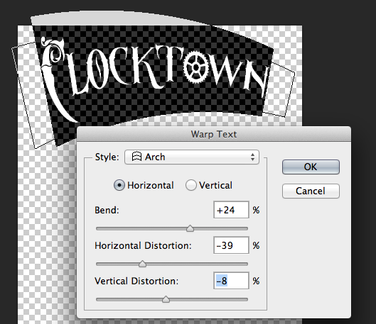
Finally, I’ve used the Create Warped Text tool to further accentuate the title.
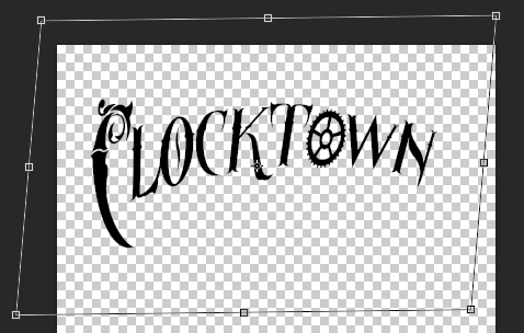
Then I’ve further warped the text using the transform skew function (Edit>Transform>Skew).
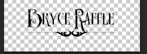
You’ll also want to create text for your author name, subtitle, etc. I’ve also added a divider, using a decorative font. I’ve used Old Retro Labels for my divider and I used Ornatique again for my name.
Layer Styles
So far, we’ve created a fairly basic-looking title for our book. It can still be taken up a notch, by giving the title some depth and texture. The easiest way to do that in Photoshop is to use Layer Styles. Right-click on the Layer for your title, and choose Blending Options.
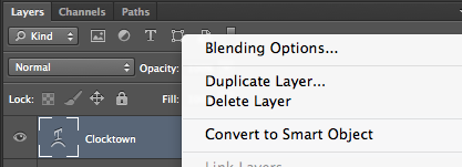
This opens up the Layer Styles panel. Here, we can adjust a number of settings for our font, including Bevel & Emboss, Drop Shadow, and Pattern Overlay. This is where the magic really happens.
Let’s start with Pattern Overlay. Click the check-box to turn it on, choose Normal for Blend Mode, and leave the Opacity at 100. Choose a Pattern. You can either choose one of the default patterns included with Photoshop or download and load a new one.
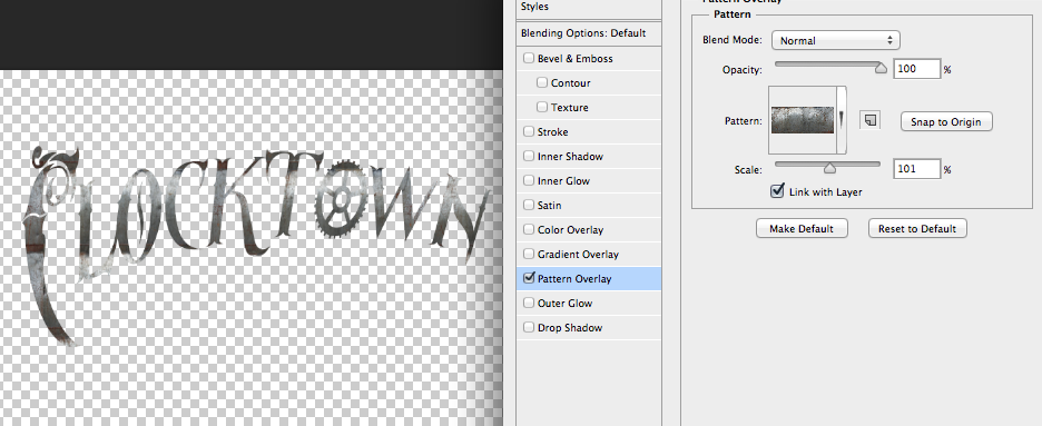
Next, add a gradient overlay. Change the Blend Mode to Color, leave Opacity at 100, and choose a gradient. Click on the gradient to open the Gradient Editor. You can choose one of the Presets or create a custom gradient. I’ve created a custom gradient with shades of brown and black.

Next, we’ll want to add a drop shadow. You’ll be able to see it more clearly once you’ve added a background for your cover. For now, these are the settings I’ve used.
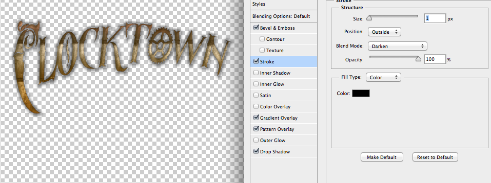
Next, Bevel & Emboss.
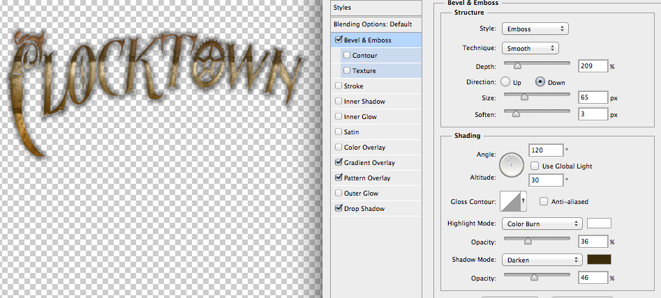
And finally, Stroke.
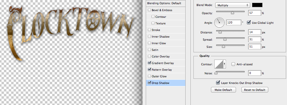
Remember, you can always come back and adjust these settings later.
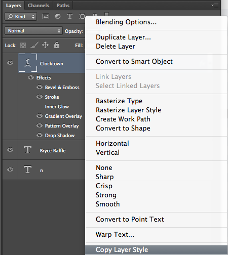
Once you’re happy with your Blending Options, click OK. Then, right-click on the title Layer, and choose “Copy Layer Style.”
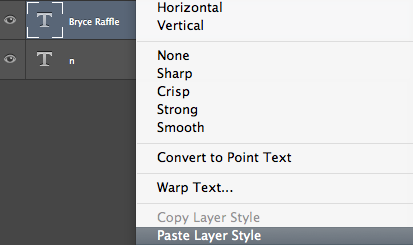
Then right-click on each of your other layers and choose “Paste Layer Style.”
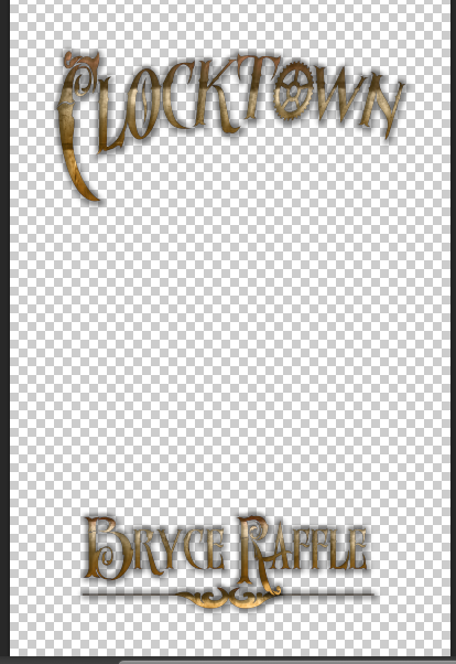
In the next part of the tutorial, we’ll look at creating a background for our cover. In the meantime, here’s what we’ve got so far.
Here’s Part Two.

One Reply to “Book Cover Design Tutorial”
Comments are closed.